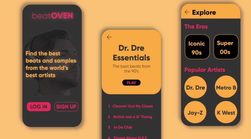
How to Choose the Right Color Scheme for Your Music App
Color is not just about making your music app look pretty. It also works as a powerful tool that impacts the user experience. When the users open the app, the color they see can instantly evoke their emotions, convey a message, and shape their perception of your brand.
Let’s imagine opening a music app filled with vibrant, energetic colors versus one with a dull, muted tone. The first one might make you feel excited and ready to explore such as Spotify.
It inspires the other developers as they constantly search for how to create a music app like Spotify. While the second might leave you feeling uninspired.
Let’s understand how to pick the right color scheme for your music app to attract and retain users.
Why is color in app design essential?
There are multiple reasons why the color scheme is essential in app design.
Emotional Impact
The colors are the source to influence the emotions of the users. Warm colors evoke excitement while cool colors offer a calming effect.
Brand Identity
The color of your app should reflect the personality of your brand and should be aligned with your target audience.
Usability and Accessibility
Make sure that your chosen color scheme offers suitable contrast and readability for all users.
Step to Choose the Right Color Scheme
Define Purpose and Audience
You should understand what is the purpose of your music app and the demographics of your target audience. A music app aimed at classical music lovers might have a different color scheme compared to one targeting teenage pop music.
Is your app meant for casual listening, music creation, or discovering new artists? And what is the age group, gender, and cultural background of your target users? You must know these things before you start developing your app.
Analyze Competitor Apps
Always learn from others in the market while you aim for uniqueness to give your users something new. You don’t have to copy them but understand the market standards and have a good starting point.
Choose a Base Color
Select a primary color that is according to the desired mood of your music application.
- Blue: Trust, calm, professionalism
- Red: Energy, passion, urgency
- Green: Growth, harmony, freshness
- Yellow: Happiness, attention, warmth
Create a Color Palette
Develop a balanced palette including the primary, secondary, and accent colors.
- Primary Colors: These are the main colors used in your app. They should be consistent with your base color and brand identity.
- Secondary Colors: These are used to complement the primary colors and provide visual interest. They should harmonize well with the primary colors.
- Accent Colors: These are used sparingly to highlight important elements like buttons, links, and notifications.
Test for Contrast and Accessibility
You should have to make sure that the colors you are using meet the usability and accessibility standards. It is particularly important for text and interactive elements. Tools like the Web Content Accessibility Guidelines contrast checker can help you know if your color combination meets the standards or not.
Get Feedback
Now, gather input from the potential uses through testing and iteration. Conduct a usability test to see how real users interact with your app and how they feel about the color scheme.
Tips for Choosing the Color Scheme for Your Music App
Limit Palette
Stick to three to five colors for a cohesive look. Using too many colors can make your app look cluttered and chaotic.
Color Psychology
Use colors to influence the behavior and emotions of your users. For example, use green for positive actions like PLAY or DOWNLOAD, as it is often associated with success and progress.
Consider Cultural Differences
You must have to be mindful of color meaning across different cultures. Such as white is mostly associated with purity in Western cultures but it symbolizes mourning in some Eastern cultures. That is why if your app has a global audience, then consider these cultural differences in your color choices.
Test in Different Lightening
Make sure that the colors work well in various lighting conditions. Users will interact with your app in various lighting conditions. Make sure that it looks good and remains functional in all environments.
Stay Updated
Keep up with design trends to maintain a modern feel. While it is important to have a unique color scheme, staying aware of current design trends can also be beneficial. It can ensure that our app feels modern and up to date which can be appealing to the users.
Examples of Effective Color Schemes
Spotify
Black background with green accents for a sleek and attention-grabbing look.
Apple Music
White with pink accents for a clean and vibrant appearance.
SoundCloud
Bright orange primary color with white and dark gray for readability.
Conclusion
So, choosing the right color scheme is essential if you want to influence your users and maintain a good revenue. You must pick the colors that set the mood and ensure that the users are able to use the application without any difficulty. Take inspiration from existing apps like Spotify, YouTube, and more, and create your music app with a USP.


