A great mobile app doesn’t just look beautiful—it feels effortless to use. Every tap, swipe, and transition should flow naturally, guiding users from one action to the next without friction. That flow is what we call a seamless user journey.
For mobile app designers, crafting this experience requires more than visual design skills—it’s about understanding human behavior, user goals, and emotional connection.
In this guide, we’ll explore how mobile app designers can create user journeys that feel smooth, intuitive, and rewarding from start to finish.
1. Start with Empathy – Know Your Users First
Before sketching a single screen, successful designers study their users.
Understanding who you’re designing for and what they need is the foundation of a strong user journey.
Key questions to ask:
- Who are your users? (demographics, goals, challenges)
- What problem does the app solve for them?
- When and how will they use it—on the go, at home, or at work?
Pro Tip: Create user personas—fictional yet data-driven characters representing your target audience. This keeps your design decisions user-focused at every stage.
2. Map the User Journey from Start to End
Once you know your users, it’s time to visualize their journey—the complete path they take inside your app.
From onboarding to checkout, every interaction should feel logical and rewarding.
Common stages of a user journey:
- Onboarding: The first impression; make it simple and welcoming.
- Exploration: Help users easily find what they need.
- Action: Simplify key tasks (booking, shopping, messaging).
- Engagement: Encourage repeat use through intuitive flow and delight.
- Feedback: Give users clear responses for their actions.
Pro Tip: Use tools like Figma, Miro, or Lucidchart to map the flow and identify potential drop-off points before design begins.
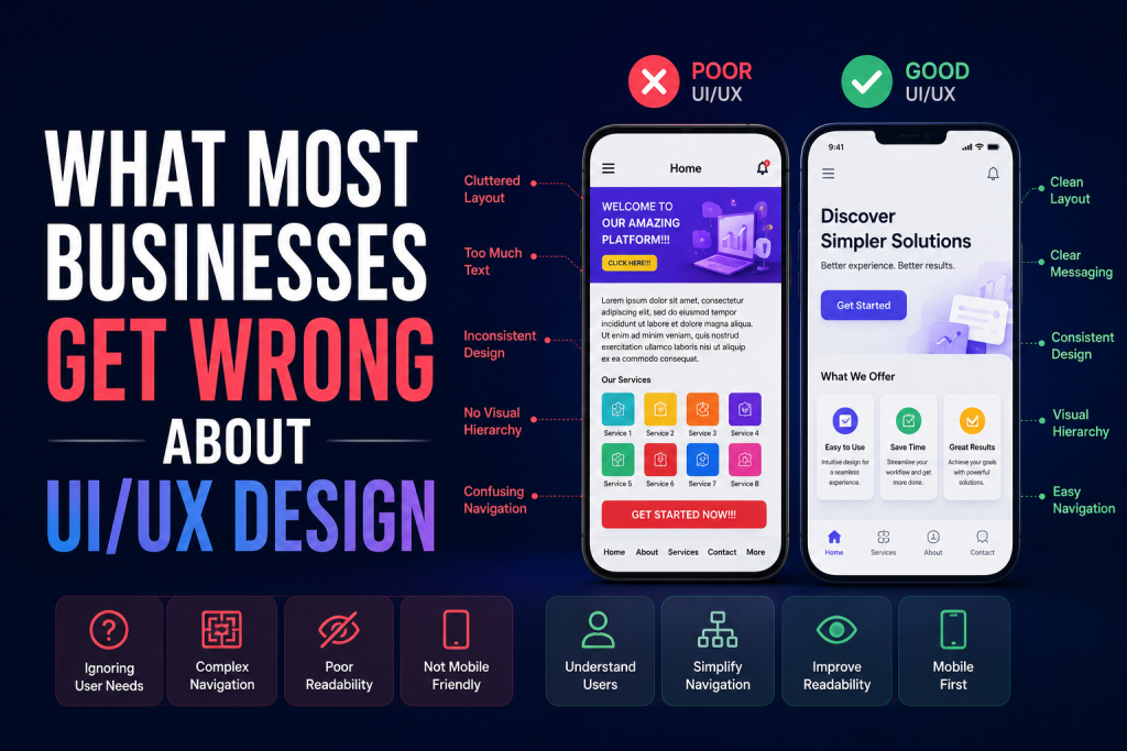
3. Simplify Navigation and Information Architecture
A smooth user journey depends on simple, intuitive navigation.
Mobile screens are small—so clarity is key.
Design navigation with:
- Minimal menu items to reduce cognitive load.
- Consistent icons and gestures users already recognize.
- Bottom navigation bars for easy thumb reach.
Pro Tip: Follow the “three-tap rule”—users should reach any key action within three taps or fewer.
4. Prioritize Visual Hierarchy and UI Consistency
Users rely on visual cues to guide their actions. A consistent layout, color scheme, and typography help them feel oriented and confident.
Focus on:
- Color contrast: Highlight key CTAs (Call-To-Actions).
- Typography: Use readable fonts for different screen sizes.
- Whitespace: Avoid clutter—give each element room to breathe.
- Component reuse: Build consistency through a design system.
Pro Tip: In tools like Figma, use components and auto-layout to maintain visual harmony across all screens.
5. Create an Engaging Onboarding Experience
The onboarding process sets the tone for your entire app experience.
If users get confused or overwhelmed in the first 30 seconds, they’ll likely never return.
Best practices for onboarding:
- Keep it short and visual—use illustrations and microcopy.
- Offer interactive tutorials that let users explore.
- Highlight key benefits, not just features.
- Include skip options for returning users.
Pro Tip: Track onboarding analytics to identify where users drop off—and refine accordingly.
6. Use Microinteractions to Guide and Delight Users
Microinteractions—like a button animation, progress bar, or subtle vibration—add emotion and feedback to user actions.
They:
- Confirm that an action was successful.
- Make the app feel alive and responsive.
- Add delight and increase user satisfaction.
Pro Tip: Keep animations under 300ms for responsiveness and avoid overuse—subtlety creates polish.
7. Test Early, Test Often
Even the most polished design can have usability issues.
That’s why user testing is critical throughout the design process.
Types of testing:
- Prototype testing: Use Figma or InVision for clickable mockups.
- A/B testing: Compare variations of UI elements or flows.
- Usability testing: Observe real users completing tasks.
Pro Tip: Record sessions to identify frustration points and areas of confusion—then iterate fast.
8. Optimize for Performance and Accessibility
Smooth journeys aren’t just about visuals—they’re about performance.
If your app lags, loads slowly, or isn’t accessible, even the best design can fail.
Checklist for optimization:
- Compress images and icons.
- Test on different screen sizes and OS versions.
- Ensure contrast ratios and text legibility meet accessibility standards.
- Add voice and gesture support where possible.
Pro Tip: Accessibility isn’t optional—it expands your audience and enhances usability for everyone.
9. Measure and Improve the User Journey Post-Launch
After launch, use analytics to track how users actually move through your app.
Monitor key metrics like:
- Session duration and retention rate
- Drop-off points in key flows
- Conversion rates and in-app engagement
Pro Tip: Use tools like Mixpanel, Firebase Analytics, or Hotjar for user behavior tracking and continuous improvement.
Conclusion
Creating a seamless user journey is an art that combines empathy, design thinking, and usability.
For mobile app designers, success comes from crafting experiences that make users feel confident, engaged, and delighted every time they open the app.
At Devoq Design, a leading UI/UX Design Agency in Alabama and UI/UX Design Agency in North Carolina, we specialize in designing intuitive, high-performing mobile apps that connect with users on every level. From wireframes to final prototypes, we focus on creating journeys that drive retention, satisfaction, and business growth.